MapLibre GL JS is the standard for open source mapping on the web. Forked from Mapbox GL JS following its 2020 change to a proprietary license, it supports nearly endless possibilities for map customization.
Here we demonstrate my favorite underused map styling and data-viz technique: halftone — and apply it to bathymetry (ocean depth) data.
If you haven’t worked with bathymetry before, check out my bathymetry tutorial. Once you have a bathymetry source on your map, you’re ready to go!
What is halftone?
Halftone is a grid of dots with different sizes. It originates as a printing technique: with a sufficiently small grid, dots of different colors appear as an intermediate color.

Why halftone maps?
Halftone can be used as a data visualization technique, with the size of the dots representing a value, e.g. population density. This is often easier to interpret and compare than the solid colors of a choropleth.
Halftone can also add detail and improve a map’s aesthetics, ranging from subtle stippling to provocative pop-art pizazz.

Unless you’re building an app for (sub)mariners, ocean depth data probably isn’t crucial to your map’s function. Nonetheless, halftone bathymetry can improve aesthetics by adding detail to the oceans.
Let’s get started!
Generating a pattern in JavaScript
To display halftone dots on the map, we need to add icons to our MapLibre style. MapLibre supports various image formats and we could even use the MapTiler UI to upload icons without writing code. But for faster (and funner) iteration, let’s generate SVG images in our JavaScript code.
Start by creating an HTMLImageElement. The size of this image determines the size of the repeating pattern on your map. For an eight pixel square:
const map = new maplibregl.Map({
      ...
 });
const htmlImage = new Image(8, 8);
We’ll draw our images with the SVG markup language. Here, I create a circle at the center of the image with radius 30% (and thus diameter 60%).
<svg xmlns="http://www.w3.org/2000/svg" height="8" width="8">
    <circle cx='50%' cy='50%' r='30%' />
</svg>
Wrap your SVG in a JavaScript string:
const svgString = `<svg xmlns="http://www.w3.org/2000/svg" height="8" width="8">
                        <circle cx='50%' cy='50%' r='30%' />
                   </svg>`;
Then load the SVG into the HTMLImageElement. Processing our SVG string with encodeURIComponent escapes special characters, which will be needed when we introduce colors.
htmlImage.src = "data:image/svg+xml;charset=utf-8," + encodeURIComponent(svgString);Displaying your pattern on the map
Once the image loads, add it to the map with map.addImage.
This function converts our vector icon to a raster image saved in the map’s style and makes it available for styling with expressions.
htmlImage.onload = () => {
  map.addImage("custom-image", htmlImage);
};
To test if our image generation worked, let’s set it as the fill-pattern for the water layer:
map.on("style.load", function () {
  map.setPaintProperty("water", "fill-pattern", "custom-image");
});Almost there!
Varied patterns
To generate dots with varied sizes, let’s wrap our image generation code in a loop and iterate the circle’s radius.
const map = new maplibregl.Map({
      ...
 });
function makeSvgImage(size) {
  const htmlImage = new Image(8, 8);
  // Start with diameter of 10% and scale to 110%
  const radius = size / 2 * 11;
  const svgString = `<svg xmlns="http://www.w3.org/2000/svg" height="8" width="8">
                       <circle cx='50%' cy='50%' r='${radius}%' />
                     </svg>`;
  htmlImage.src = "data:image/svg+xml;charset=utf-8," + encodeURIComponent(svgString);
  htmlImage.onload = () => {
     map.addImage("circle-" + size, htmlImage);
  };
}
for (let i = 1; i<= 10; i++){
   makeSvgImage(i)
}
We can test our code by viewing the generated SVG icons in HTML:
Displaying halftone on the map
To proceed, you’ll need a bathymetry data. If you haven’t already, follow this tutorial to add a bathymetry source with MapTiler (or follow along with another data source).
Style your data using the step expression, telling the map to display a different pattern depending on ocean depth:
map.on("style.load", function () {
 map.addLayer({
  id: "bathymetry",
  type: "fill",
  source: "ocean",
  "source-layer": "contour",
  paint: {
   "fill-pattern":
    [
     "step",
     ["get", "depth"],
     "circle-1",
     -6000, "circle-2",
     -5000, "circle-3",
     -4000, "circle-4",
     -3000, "circle-5",
     -2000, "circle-6",
     -1000, "circle-7",
     -500, "circle-8",
     -100, "circle-9"
    ]
  },
// Replace "waterway" with the layer just above the "water" layer is your style.
// This places our bathymetry layer just below labels.
 }, "waterway");
});
And voila:
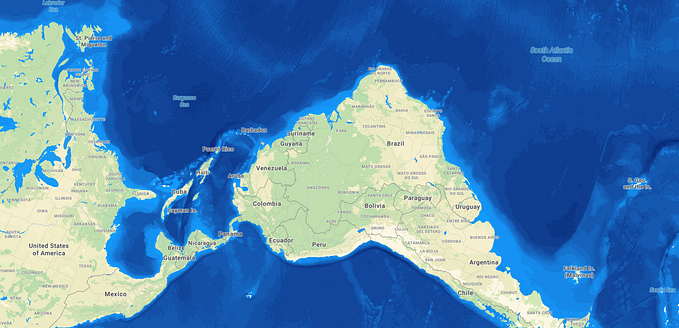
Final touches
This bathymetry dataset doesn’t cover the shallowest areas: note the gaps near the coasts and that lakes are not included. We can address this by adding the pattern of the shallowest depth to the water layer:
map.on("style.load", function () {
  map.setPaintProperty("water", "fill-pattern", "circle-10");
})
Unfortunately, now the water layer is visible through the transparent background of the bathymetrylayer. To fix this, we need to make our icons opaque. Add a rect element to the SVG before the circle with your background color of choice.
<svg xmlns="http://www.w3.org/2000/svg" height="8" width="8">
  <rect width="100%" height="100%" fill='#fff' />
  <circle cx='50%' cy='50%' r='${radius}%' />
</svg>
Just for fun, let’s half the size of our pattern and create a more subtle effect:
const htmlImage = new Image(4, 4);And there we have it:
That’s just the tip of the iceberg! Why not try your own a creative twist? You could apply the technique to different data, combine multiple colors, experiment with shapes besides circles, or even make an animated pattern.
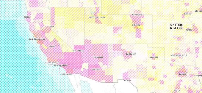
In this map, I combine bathymetry with cattle and human population data. I pay homage to color newspaper with cyan, yellow and magenta dots, arranged at a diagonal grid for a more dynamic appearance.
Oh the places you’ll map!